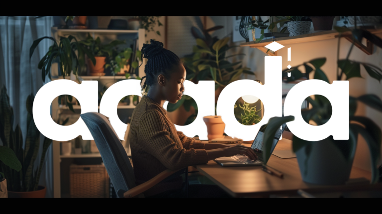
When I first embarked on the journey to design Acada, a mobile app aimed at young Nigerians aspiring to break into the tech industry, I knew it had to be more than just another educational platform. The tagline “Empowering Tech Dreams, One Click at a Time” encapsulated the mission perfectly. Every click on Acada needed to bring users closer to realizing their tech dreams.
The project began with extensive research. I conducted focus groups with high school students, university students, and recent graduates. Their stories were compelling—many had the passion and drive to succeed in tech but faced significant barriers. Access to quality education, mentorship, and resources was limited. This insight became the cornerstone of our design process.
Working with the rest of the team, including a UX writer and two designers, we used Miro as a canvas for brainstorming and organizing ideas. Our collaboration was seamless, facilitated by regular Zoom meetings and Slack standups that kept everyone aligned and motivated. The synergy within the team allowed us to refine our ideas continuously and ensure that every aspect of the app resonated with our users’ needs.
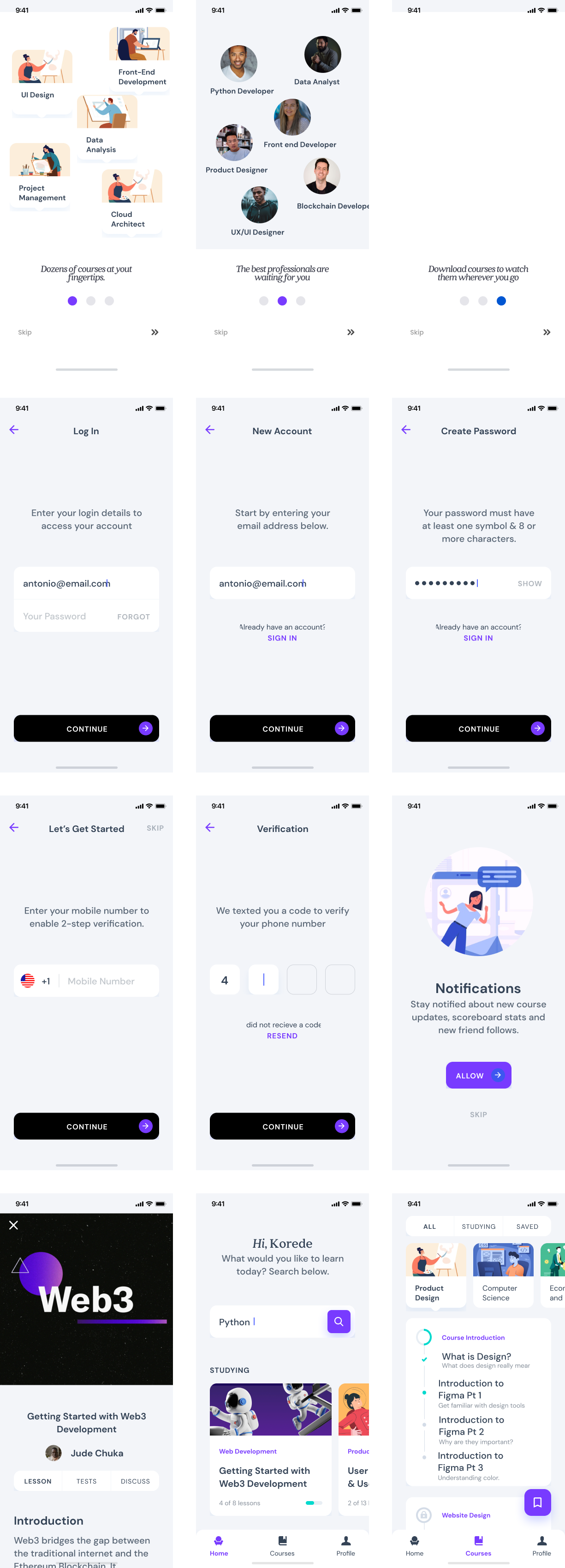
As I sketched out the initial wireframes, I envisioned a space where users could chart their personalized learning paths. Whether they aspired to be web developers, data scientists, or cybersecurity experts, Acada would guide them every step of the way. The interactive courses and tutorials were designed to be hands-on and engaging, making complex topics accessible and enjoyable.
One of the most fulfilling aspects of this project was integrating the mentorship and networking features. Connecting users with industry professionals created a bridge between aspiration and achievement. The discussion forums and networking events turned the app into a vibrant community, fostering collaboration and support.
Our design process was iterative and collaborative. We developed low-fidelity wireframes to outline the app’s layout and functionality, followed by high-fidelity prototypes using Figma for detailed design and interactive elements. During usability testing, the feedback was overwhelmingly positive. Users appreciated the personalized learning pathways and the motivational elements like achievements and leaderboards. Seeing their progress visualized on the app made their goals feel tangible and within reach.
Designing the visual aspects of Acada was equally important. I chose a vibrant color palette to reflect the energy and potential of the young users. The modern typography ensured clarity, while engaging visuals and custom icons made navigation intuitive and enjoyable.
In the end, Acada was more than just an app—it was a beacon of hope and opportunity for young Nigerians. Each feature, each design choice, was made with the intention of empowering tech dreams, one click at a time. Working on this project, especially with such a talented and dedicated team, was a testament to the power of thoughtful, user-centered design and its ability to make a real difference in people’s lives.


