Meseekna Simulation is an innovative web-based business decision making simulation used for talent assessment and training across various roles and industries. Users are immersed in realistic scenarios where they must analyze information and make strategic decisions. The simulation measures over 80 cognitive parameters to provide organizations with unbiased insights into candidates’ thinking skills and decision-making potential.
However, despite the immense value of the underlying simulation technology, feedback indicated the user interface design was severely outdated and confusing, obstructing the core user experience. As the lead UX designer on this project, my objective was to completely revamp the UI to match the innovation of the sim technology itself.
The goals were to provide intuitive navigation, streamline flows, increase engagement, and craft a contemporary aesthetics true to the Meseekna brand. This case study outlines my UX process and solutions for accomplishing these goals and transforming the overall user experience.

To kick off the redesign, I first needed to deeply understand the personas using the simulation and their needs, pains, and behaviors. The primary users included:
- Job candidates taking the simulation as part of recruitment screening
- New employees going through onboarding and orientation
- Existing employees doing training for development
Through stakeholder interviews, I learned how each user group interfaces with the simulation and what their motivations are. For candidates, the simulation is often the first impression of the company, so their experience can influence recruitment. For new hires, it establishes expectations for training standards. For existing employees, it is vital for development and growth opportunities.
To further reveal user needs, I went through the simulation myself from each persona perspective and analyzed feedback comments from past users. Key pain points that emerged included:
- Hard to navigate complex menu system
- Unclear how actions relate to simulation outcomes
- Confusing flows for making decisions
- Overly complex information architecture
- Outdated visual aesthetics
It became clear that in order to unlock the full potential of the simulation, the user experience needed a complete overhaul.


With a firm grasp on user needs, I worked with stakeholders to define the product strategy for the redesign that would guide all design decisions:
- Quickly understand how to use the simulation
- Feel immersed in a realistic experience
- Make decisions confidently
- Receive feedback on those decisions
- Increase simulation completion rates
- Gather unbiased data on user cognitive abilities
- Showcase innovative capabilities to users
- Support recruiting and training initiatives
- Modern and friendly aesthetics
This strategy formed the core design principles for crafting an experience that serves user, business, and experience goals.
Equipped with the product strategy, I began conceptualizing solutions to address the identified user pain points and meet project goals. This involved sketching flows, iterating on wireframes, and developing interactive prototypes.
Some key ideas that emerged included:
- Onboarding: Step-by-step walkthrough to introduce the simulation
- Activity Feed: Central hub for notifications and updates
- Action Search: Enable quick access to decision options
- Consequence Feed: Show simulation reactions to user actions
- Styleguide: Visual aesthetic epitomizing the Meseekna brand

Through rapid ideation, I explored many concepts to enhance findability, usability, and understandability within the experience. Stakeholder reviews and user testing on prototypes allowed quick validation of design directions.


After several iterative rounds, I arrived at finalized designs that solved the core problems identified in my research. Some key features of the new experience included:
- Cutting through complex menus, the information architecture was reduced down to only essential top level pages and key decision points. This simplified navigation and made flows more linear.
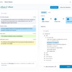
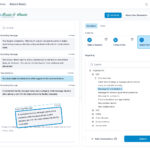
- Rather than deeply nested menu systems, users can now quickly search for any action they want to take. This enabled quick access to decisions in the simulation.
- A panel shows how the user’s decisions directly impact different metrics in the simulation, making the action-reaction relationships clear.
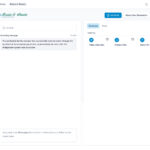
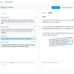
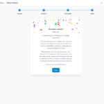
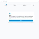
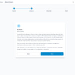
- Step-by-step guidance introduces the simulation concepts before free navigation. Tooltips are layered throughout to aid first-time users.
- Important updates are now centralized rather than scattered. Users can easily review past notifications.
- Colors, typography, illustrations, and interface elements were redesigned to craft a contemporary, energetic aesthetic true to the innovative Meseekna brand.
These solutions aimed to directly address the problems uncovered in my research in order to meet the strategic goals defined.

