When I joined the Uniqway project, our mission was clear: to simplify the process of studying abroad for students worldwide. The tagline “Simplifying Study Abroad, One Step at a Time” perfectly encapsulated our goal. Every feature and interaction on Uniqway needed to make the complex process of studying abroad easier and more accessible for students.
Our journey began with extensive research. We conducted surveys and interviews with students, education counselors, and industry experts to understand the challenges and pain points in the study abroad process. The feedback highlighted the need for a streamlined, user-friendly platform that provides comprehensive support from choosing a destination to securing a visa. These insights became the foundation of our design strategy.
Collaboration was essential to our success. Working alongside a dedicated team, including a UX writer and two designers, we used Miro as our brainstorming canvas. Regular Zoom meetings and daily Slack standups ensured we stayed aligned and focused. This collaborative approach allowed us to refine our ideas continuously and address user needs effectively.
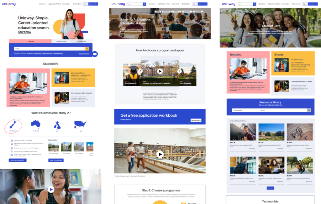
Starting with the information architecture, we mapped out a logical and intuitive site structure. We aimed to simplify navigation, ensuring users could easily find the information they needed. Next, we created low-fidelity wireframes to outline the basic layout and functionality, which served as the blueprint for our high-fidelity prototypes developed in Figma.
One of the standout features we designed was the personalized recommendation engine. This tool allows users to receive tailored program recommendations based on their budget, immigration requirements, and career goals. With over 30 destinations to choose from, students could find programs that matched their unique needs and aspirations.
Our end-to-end support system was another critical component. We integrated features that provide comprehensive visa and admission assistance, leveraging our study abroad partners’ expertise. This ensured students received all the help they needed throughout their journey, making the process as smooth as possible.
The platform also highlighted our counselors’ extensive experience. With over 15 years in the industry, our counselors have guided countless students to success. This expertise was showcased through detailed profiles and testimonials, building trust and confidence among users.
Throughout the design process, usability testing was a priority. We conducted tests with students and counselors, gathering valuable feedback and iterating on our designs to enhance usability and address any issues. The positive feedback confirmed that our approach was effective and user-centric.
Visually, we aimed to create a professional yet inviting atmosphere. We chose a vibrant and reassuring color palette to convey trust and optimism. Modern, readable fonts enhanced clarity, while engaging visuals and custom icons guided users through the platform seamlessly.
In the end, the redesigned Uniqway platform became more than just a tool for studying abroad. It became a trusted partner for students, offering support and guidance at every step. Each feature and design choice was made with the intention of simplifying study abroad, one step at a time. Working on this project, especially with such a talented and dedicated team, was a testament to the impact of thoughtful, user-centered design in transforming educational experiences.


