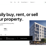
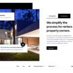
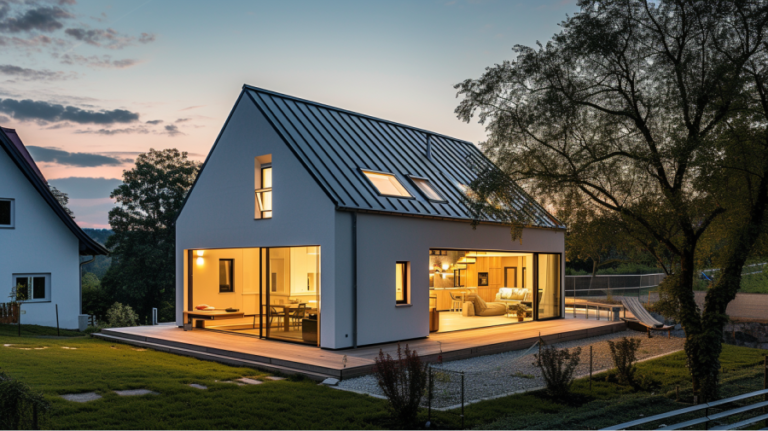
When I first took on the challenge of revamping Viello’s web and native app, I knew this was an opportunity to make a significant impact. The existing app facilitated fractional ownership of real estate properties, but it lacked visual engagement and a seamless user experience. Our goal was clear: uplift the brand through improved navigation, color schemes, and user interface design, making the app more appealing and user-friendly.
The Journey Begins
Understanding the real estate market and the concept of fractional ownership was my first step. I conducted interviews with current users and stakeholders to identify pain points and opportunities for improvement. The insights were invaluable—users wanted an engaging, intuitive, and visually appealing platform that made the process of investing in real estate simple and enjoyable.
Working with a team of developers, we formed a collaborative environment where ideas flowed freely. Communication was key, and we kept our exchanges focused through regular emails and project updates. Using Figma, we mapped out the redesign, ensuring every detail was meticulously planned.
Crafting the Solution
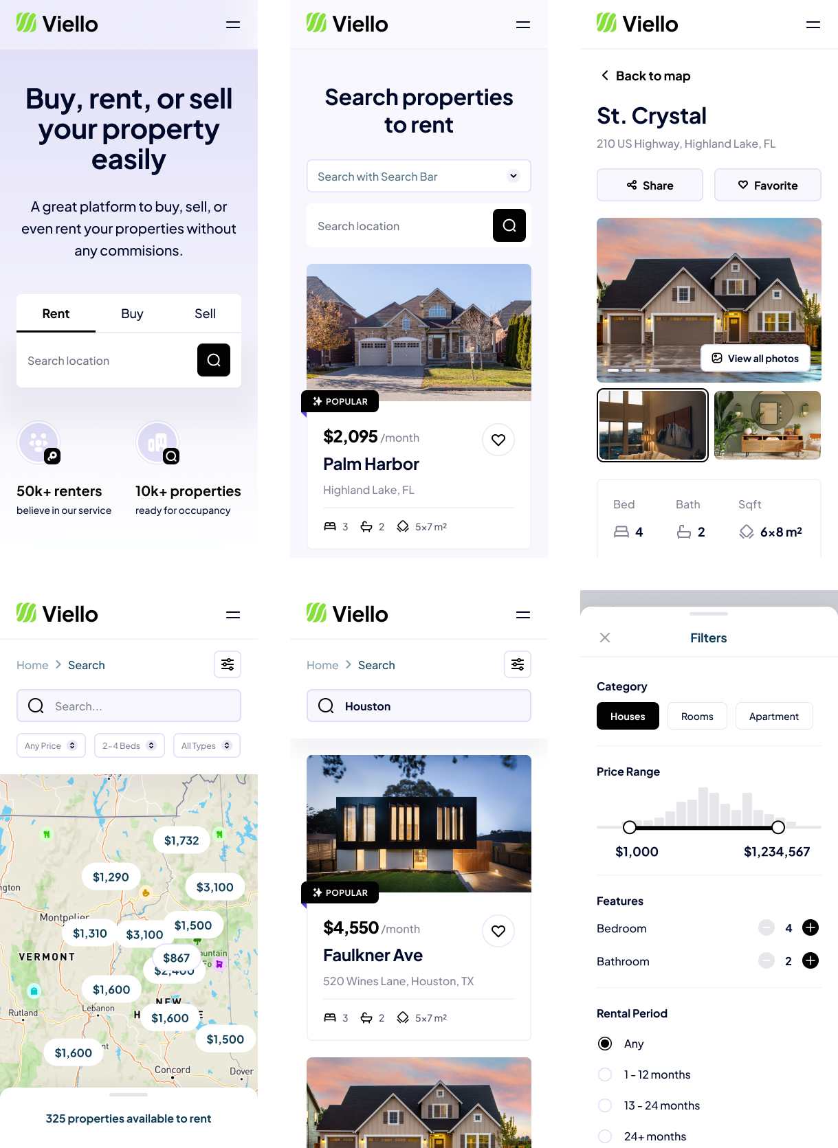
With our research in hand, I started sketching out the new user interface. The initial designs focused on simplifying the navigation and enhancing the visual appeal. I created UI mockups that highlighted key areas for improvement, such as the navigation menu, property listings, and user dashboards. Each element was designed to be intuitive and engaging, ensuring users could easily navigate the app.
Design and Development
The redesign process involved several key tasks and deliverables:
- Redesign the app’s user interface: We aimed to enhance visual appeal and user engagement through modern design principles.
- Improve navigation: Ensuring a seamless user experience was paramount, so we streamlined the navigation to make it more intuitive.
- Develop UI mockups: I delivered detailed mockups in Figma, ready for the development team to implement.
- Consistent alerts and reminders: We incorporated consistent placements for alerts and reminders to enhance usability.
- Collaborate with the development team: Working closely with developers, we ensured the design was feasible and implemented correctly.
Using my skills in UX/UI design and my experience in the real estate sector, I brought the vision to life. The design tools, particularly Figma, were crucial in creating high-fidelity prototypes that could be easily shared and reviewed.
Overcoming Challenges
Designing for an app that deals with fractional real estate ownership presented unique challenges. We had to ensure that complex financial information was presented clearly and accessibly. Through iterative testing and user feedback, we refined the design to meet these needs.
One of the biggest challenges was improving the app’s navigation. Users often felt lost within the app, so we introduced a more intuitive menu structure and clear pathways to key features. The onboarding process was also revamped to help new users get started quickly and confidently.
Final Touches
The visual design was the final piece of the puzzle. I chose a sophisticated color palette that reflected trust and stability, essential qualities for a real estate investment platform. Modern typography ensured clarity, while engaging visuals and custom icons made the app visually appealing and easy to navigate.
The Impact
In the end, our redesigned app transformed the user experience for Viello’s clients. The app became more engaging and user-friendly, embodying the tagline: “Your Key to Smart Real Estate Investments.” Users found it easier to navigate, invest, and manage their real estate investments, which led to increased satisfaction and engagement.
This project was a testament to the power of thoughtful, user-centered design. It demonstrated how a well-designed digital platform could address industry-specific challenges and create impactful solutions. Working with such a dedicated team and seeing our ideas come to life was an incredibly fulfilling experience.
In conclusion, designing for Viello was not just about enhancing an app; it was about creating a tool that empowers users to invest in real estate with confidence and ease. The journey was challenging, but the results were worth every effort.

