When I was brought on to redesign EnglishCafe’s online platform, the goal was clear: create an engaging, intuitive, and efficient learning environment for both students and teachers. The tagline “Unlocking English Fluency, One Lesson at a Time” perfectly captured our mission. Every lesson, interaction, and feature needed to contribute to the user’s journey toward mastering English.
The project began with thorough research. I conducted surveys and interviews with students and teachers to understand their needs, preferences, and pain points. Their feedback highlighted the necessity for a platform that was not only educational but also easy to navigate and engaging. This user insight became the foundation of our design approach.
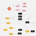
Collaboration was key. Working alongside a talented team of a UX writer and two designers, we utilized Miro as our canvas for brainstorming and organizing ideas. Our process was highly collaborative, with regular Zoom meetings and daily Slack standups ensuring everyone was aligned and focused. This constant communication allowed us to iterate quickly and refine our ideas effectively.
**Feature Development:**
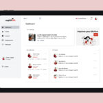
I worked on several key features to enhance the platform’s functionality and user experience. One standout feature was the **Personalized Learning Dashboard**. For students, this dashboard displayed their progress, upcoming lessons, and recommended activities, making their learning journey clear and motivating. For teachers, it offered tools to manage classes, track student performance, and schedule lessons, enhancing their ability to deliver effective education.
**Interactive Learning Modules:**
Another significant feature was the development of interactive learning modules. We designed video lessons, quizzes, and interactive exercises to make learning engaging and effective. Gamification elements, such as badges and progress tracking, were incorporated to keep students motivated and on track.
**Communication Tools:**
We also integrated robust communication tools. These included chat and discussion forums for student-teacher interaction and video conferencing for live classes and one-on-one tutoring sessions. This ensured that learning was not just a solitary activity but a collaborative and interactive experience.
**Resource Library:**
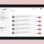
The resource library was another critical component. It provided a comprehensive collection of learning materials accessible to both students and teachers. With search and filter options, users could quickly find specific resources, enhancing their learning efficiency.
Our design process was iterative and collaborative. We developed low-fidelity wireframes to outline the app’s layout and functionality, followed by high-fidelity prototypes using Figma for detailed design and interactive elements.
Throughout the design process, usability testing was essential. We conducted tests with both students and teachers, gathering valuable feedback and iterating on our designs to improve usability and address any issues. The positive feedback we received confirmed that our approach was on the right track.
Visually, we wanted the platform to be both professional and inviting. We chose a calm and professional color palette to create a conducive learning environment and selected readable, modern fonts to enhance clarity. Engaging visuals and custom icons were used to support the content and guide users through the platform.
In the end, the redesigned EnglishCafe platform was more than just a tool for learning English. It became a supportive, engaging, and efficient environment for both students and teachers. Every feature and design choice was made with the intention of unlocking English fluency, one lesson at a time. Working on this project, especially with such a dedicated and creative team, was a testament to the impact of thoughtful, user-centered design in transforming educational experiences.

