When I joined the HubbleIQ project, our mission was to create a seamless solution for end users navigating the technological challenges of remote work. The tagline “Deploy, Detect, Resolve” perfectly encapsulated our goal. Every design decision and user interaction aimed to make identifying and resolving tech issues as effortless and proactive as possible.
The project was a collaborative effort, involving a dedicated team of two designers, one project manager, three engineers, and the two founders. Our objective was to develop a robust dashboard and a Chrome extension that would empower users to conquer end-user tech issues with AI.
Understanding the Problem
We began by understanding the common technological challenges remote workers face. Issues like poor WiFi, slow internet, device sluggishness, and application outages were identified as significant productivity hurdles. The HubbleIQ agent was designed to assess the user’s local environment, detect these issues, and provide immediate, proactive assistance.
Collaboration and Tools
Collaboration was crucial. We utilized regular Slack standups and Zoom meetings to ensure everyone was aligned. FigJam was our go-to tool for brainstorming sessions, where we mapped out user flows and identified key features. Using Figma, we developed interactive prototypes to visualize our ideas and gather feedback.
Dashboard Design
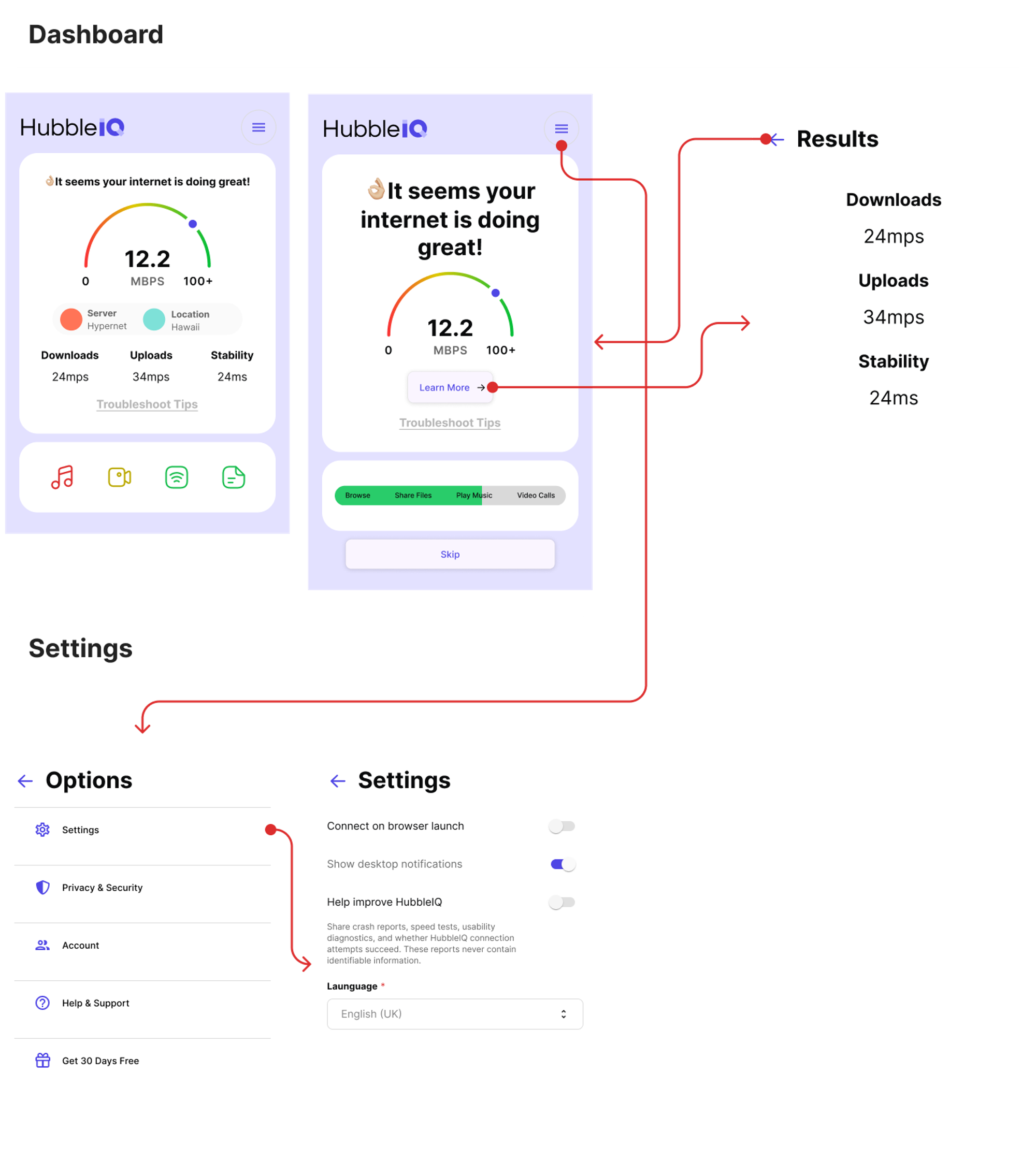
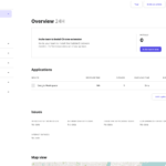
The dashboard was central to our design efforts. It needed to be intuitive, informative, and user-friendly. We focused on creating a clean and organized interface that displayed critical information clearly. Key features included real-time alerts, detailed issue reports, and actionable insights. The goal was to provide IT departments with the necessary tools to assist remote users effectively.
Chrome Extension
The Chrome extension was designed to offer users a convenient way to interact with HubbleIQ directly from their browser. We prioritized ease of use, ensuring that users could quickly access important features without disrupting their workflow. The extension provided real-time notifications and immediate solutions, making it a valuable tool for remote workers.
User Flows and Prototypes
Mapping out user flows was essential to ensure a smooth user experience. We designed flows that guided users through the process of deploying HubbleIQ, detecting issues, and resolving them efficiently. High-fidelity prototypes were created to simulate the final design and functionality. These prototypes were shared with stakeholders and tested with target users to gather feedback and make necessary adjustments.
Visual Design
Visually, the platform needed to convey professionalism and reliability. We chose a clean and modern design aesthetic, with a focus on clarity and usability. The color palette and typography were selected to enhance readability and provide a sleek, professional look.
Implementation and Testing
Collaboration with engineers was critical during the implementation phase. Detailed annotations and documentation were provided to ensure a smooth handoff. We used tools like ClickUp to manage sprints and track progress. Regular testing was conducted to identify and fix any issues, ensuring the platform was robust and user-friendly.

Positive Impact
The feedback from users and stakeholders was overwhelmingly positive. HubbleIQ successfully addressed the technological challenges of remote work, providing a proactive solution that enhanced productivity and user experience. IT departments reported improved efficiency in assisting remote users, thanks to the detailed insights and real-time alerts provided by the dashboard and extension.
In the end, the work on HubbleIQ’s dashboard and Chrome extension successfully positioned the platform as a leader in resolving end-user tech issues. Each design choice and feature was crafted with the intention of empowering users and enhancing their remote work experience. Working on this project, especially with such a talented and dedicated team, was a testament to the power of thoughtful, user-centered design in transforming digital service experiences.


